Display user dialog with multiple controls.
Syntax: @uidialog(spec1[, spec1, [spec3, [...])
spec#: string
Return: integer
Displays a dialog with any number of controls that you define, including edit fields, listboxes, radio buttons, checkboxes, text, and captions. You may specify an combination of controls, and they will be arranged in the order they are entered. EViews attempts to lay the controls out in a visually pleasing manner, and will do its best to size and arrange the dialog accordingly.
Each cinfo# item is a specification of the control type in quotes (“Edit”), followed by appropriate parameters. You may specify any combination of controls, where each should follow one of the following forms:
Edit field | “Edit”, IO_String, prompt_string[, max_edit_length] |
Listbox | “List”, IO_StringOrScalar, prompt_string, list_string |
Radio buttons | “Radio”, IO_Scalar, prompt_string, list_string |
Checkbox | “Check”, IO_Scalar, prompt_string |
Text | “Text”, text_string |
Caption | “Caption”, caption_string |
Column break | “Colbreak” |
OK Button | “Button”, button_string |
Cancel Button | “Buttonc”, button_string |
In the above table, the parameters can be described as:
IO_String | string used to initialize an edit field and hold the final edit field text. |
IO_Scalar | scalar used to initialize a radio or checkbox selection, and hold the final selection. |
IO_StringOrScalar | string or scalar used to initialize a listbox selection, and hold the final selection. |
prompt_string | string used as the label for the control, or the groupbox label for radio buttons. |
max_edit_length | scalar for the maximum characters allowed in an edit field. |
list_string | space delimited list of entries for a listbox or radio buttons. |
text_string | text to be used in a text control. |
caption_string | text to be used as the caption of the dialog in its titlebar. |
button_string | text to be used on the button. |
Note that parameters whose names begin with “IO_”, e.g. “IO_String” should be passed into the function using replacment variables or objects in the workfile, as they are used to return results.
The “button” and “buttonc” controls add a custom button to the dialog. The dialog will close after a button has been pressed. The behavior of the button will depend on the type of button —buttons of type “button” will behave in the same way as the “OK” button (i.e., all variables passed into the dialog will be updated to reflect changes made to their corresponding controls). Buttons of type “buttonc” will behave in the same way as the “Cancel” button (i.e., all variables will be reset to the values that were passed into the dialog).
The return value of the dialog will correspond to the order in which buttons are placed in the dialog. If only one button (apart from the standard “OK” and “Cancel”) is included in the dialog, the return value for that button will be “1”. If there is more than one button, then the first button will return a value of “1”, the second will return a value of “2” and so on. Note that the return value is independent of whether the button was of type “button” or “buttonc”. The specification for the button controls is (“button[c]”, “text”) where text specifies the text that will be on the button.
Examples
scalar dinner = 2
string dinnerPrompt = "Choose dinner"
string menu = """Chicken Marsala"" ""Beef Stew"" Hamburger Salad"
string name
string namePrompt = "Enter your name"
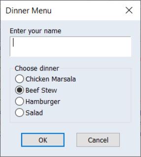
scalar result = @uidialog("Caption", "Dinner Menu", "Edit", name, namePrompt, 64, "Radio", dinner, dinnerPrompt, menu)
These commands display a dialog with an edit field and four radio buttons labeled “Chicken Marsala”, “Beef Stew”, “Hamburger”, and “Salad”. The title “Enter your name” appears above the edit field, while the groupbox surrounding the radio buttons is labeled “Choose dinner”. The words “Dinner Menu” appear in the caption area, or titlebar, of the dialog. The edit field is initially blank, since we did not assign any text to the string NAME. The dinner selection radio buttons are initialized with the value 2, so the “Beef Stew” radio will be selected. We limit the name length to 64 characters.
string introString = "We have many pieces to suit your style."
string clothesList = "Shirt Pants Shoes Hat Tie"
string listTitle = "Please make a selection"
scalar selection = 3
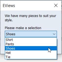
@uidialog("text", introString, "list", selection, listTitle, clothesList)
This creates a dialog with a text string and a listbox. The text “We have many pieces to suit your style” appears at the top. A listbox follows, with the label “Please make a selection” and the options: “Shirt”, “Pants”, “Shoes”, “Hat”, and “Tie”. The listbox is initialized to the third item, “Shoes”. If the user then selects the first item, “Shirt”, from the listbox and presses OK, the scalar SELECTION will hold the value 1.
Note that the text control can be used to help achieve the layout you desire. You can use it to insert empty text strings to add space between adjacent controls. For example,
scalar a = 1
scalar b = 0
@uidialog("check", a, "Option 1", "text", "", "check", b, "Option 2")
will leave a space between the two checkboxes. In more complicated dialogs, this may also push the latter controls to a second column. You may have to experiment with the appearance of more complex dialogs.
Cross-references
See
“User-Defined Dialogs” for additional discussion.
For a detailed description of each control type, see
@uiedit,
@uilist,
@uiprompt,
@uiradio.


