Panel Statistics
EViews offers varying levels of support for computations in panel workfiles.
At the most basic level, in the absence of panel specific settings, if computation of a statistic is available in a panel workfile, EViews computes the statistic on the stacked data, accounting for seams between the data when evaluating lags and leads of variables. This class of computation implicitly assumes homogeneity across cross-sections.
In more sophisticated settings, such as the equation estimators seen in
“Panel Estimation” and
“Panel Cointegration Estimation”, EViews supports various procedures that account specifically for various aspects of the panel structure of the data.
In the remainder of this chapter we describe a few other calculations in EViews that are “panel aware” in the sense that there are settings that account for the panel structure of the data. Some of these topics are discussed elsewhere; in these cases, we simply provide a link to the relevant discussion.
Time Series Graphs
EViews provides tools for displaying time series graphs with panel data. You may use these tools to display a graph of the stacked data, individual or combined graphs for each cross-section, or a time series graph of summary statistics for each period.
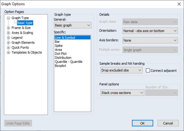
To display panel graphs for a series or group of series in a dated workfile, open the series or group window and click on to bring up the Graph Options dialogIn the Panel options section on the lower right of the dialog, EViews offers you a variety of choices for how you wish to display the data.
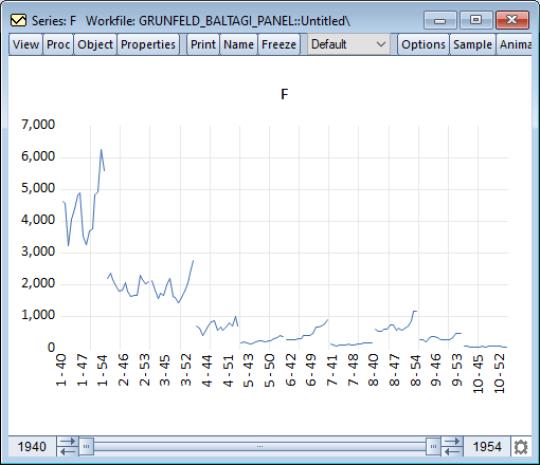
Here we see the dialog for graphing a single series. Note in particular the panel workfile specific section which controls how the multiple cross-sections in your panel should be handled. If you select EViews will display a single graph of the stacked data, labeled with both the cross-section and date. For example, with a Line & Symbol type graph, we have
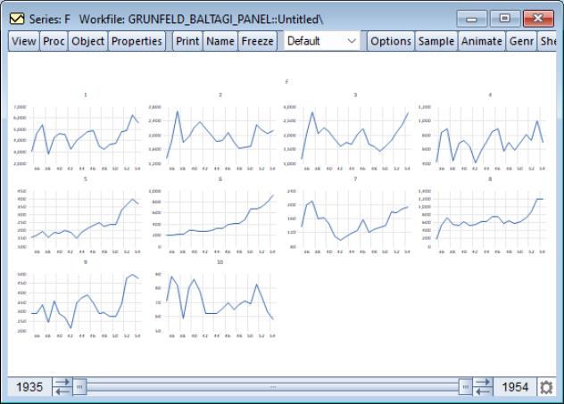
Alternately, selecting displays separate time series graphs for each cross-section, while displays separate lines for each cross-section in a single graph. We caution you that both types of panel graphs may become difficult to read when there are large numbers of cross-sections. For example, the individual graphs for the 10 cross-section panel data depicted here provide information on general trends, but little in the way of detail:
Nevertheless, the graph does offer you the ability examine all of your cross-sections at-a-glance.
The remaining two options allow you to plot a single graph containing summary statistics for each period.
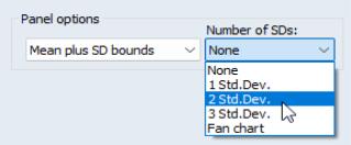
For line graphs, you may select , and then use the drop down menu on the lower right to choose between displaying no bounds, and 1, 2, or 3 standard deviation bounds. For other graph types such as area or spike, you may only display the means of the data by period.
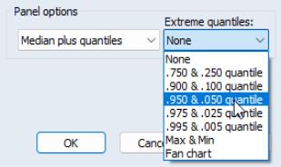
For line graphs you may select Median plus quantiles, and then use the drop down menu to choose additional extreme quantiles to be displayed. For other graph types, only the median may be plotted.
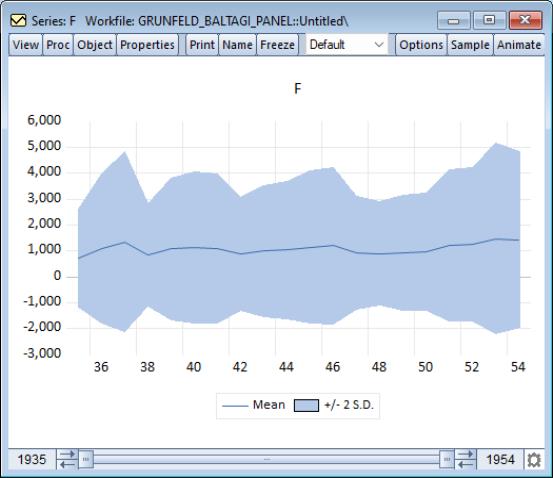
Suppose, for example, that we display a line graph containing the mean and 2 standard deviation bounds for the F series. EViews computes, for each period, the mean and standard deviation of F across cross-sections, and displays these in a time series graph:
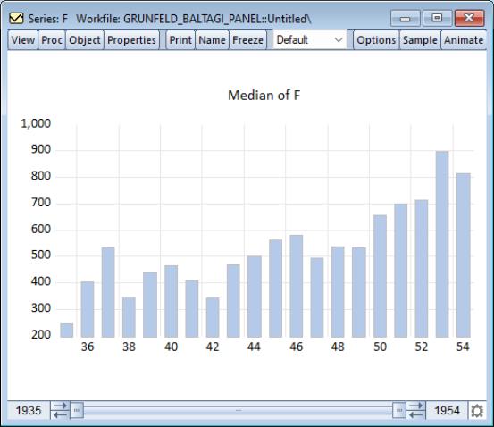
Similarly, we may display a bar graph of the medians of F for each period:
Displaying graph views of a group object in a panel workfile involves similar choices about the handling of the panel structure.