Illustrative Examples
Starting from the premise that the most useful method of documenting categorical graphs is to work through examples, we begin by describing the construction of a few representative cases. We divide these examples into two broad categories: graphs which display categorical summaries of the data, and graphs which display the raw data with category identifying information.
Since there is considerable detail in many of the example graphs, we have saved the graphs and then imported them directly into the manual, rather than using the usual screen capture approach.
Category Summaries
Perhaps the most common form of categorical graph involves the display of summary information computed for subsets of observations. For this type of categorical graph, we plot summaries based on the classification, not the original data.
We consider three examples of summary graphs: the first example involves simple plots of descriptive statistics computed for each group; the second example produces line plots from categorical descriptive statistics; the third example constructs analytical graphs for each factor level (category).
Descriptive Statistics
The simplest categorical graph compares values for descriptive statistics for observations in each category.
For our first set of examples, we employ the workfile “Gulfcoast.WF1” which contains demographic information for counties located in the Gulf Coast region of the United States. The workfile consists of 234 observations; 117 counties measured at two different periods (July 2005 and January 2006). The latter measurement is from a special assessment taken by the Census Bureau to measure the impact of hurricanes Rita and Katrina on population in the region.
The series POP contains data on the population in each county (in thousands). The series YEAR identifies the period associated with each observation, while STATE_NAME and COUNTY_NAME are categorical series that identify the observation at the state and county level, respectively.
We begin by constructing a summary graph comparing total population in the two periods. There are three parts to specifying this graph.
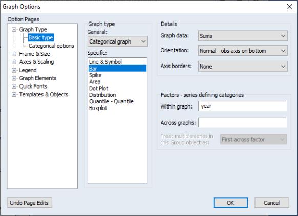
First, open the series POP and select to display the graph dialog, which should automatically open to the group. Select from the dropdown and from the type in the middle of the dialog to identify the main graph type.
Next, select in the dropdown on the right-hand side of the dialog. This setting instructs EViews to plot the sum of POP computed for each subset of the data.
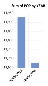
Lastly, we enter “YEAR” in the edit field. EViews will construct categories using the two unique values in YEAR (YEAR=2005 and YEAR=2006), and will display the summary statistics within a single graph frame.
Click on to accept the settings. EViews will display a bar graph showing the total population for each year, computed by taking sums of POP over all 117 counties in the region for the given year. We see that total population in the first year was roughly 12 million, and that the total population in the region falls by roughly 250,000 over the periods.
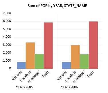
To gain additional insight into the composition of the population change, we may construct a categorical graph showing the sums of POP categorized using both YEAR and STATE_NAME. Double click on the graph window to display the dialog, edit the edit field to read “YEAR STATE_NAME”, and click on to display the updated graph.
EViews computes the total population for each distinct combination of YEAR and STATE_NAME, and displays bar graphs of the results in a single graph frame. Note that the set of bars for YEAR=2005 are displayed first, followed by the bars for YEAR=2006. Also note that the bars for a given STATE_NAME are assigned the same color (i.e., the bars for “Alabama” in the two years are both blue, the bars for “Louisiana” are both red, etc.) to facilitate comparison across years.
The ordering of the bars in the graph follows the order in which the categorical variables were entered; the factors entered first vary more slowly than later factors (for an apparent exception to the rule, see
“Line Graphs”). Since YEAR is the first factor in the list, it varies more slowly,
i.e., the values for STATE_NAME are grouped within a given year.
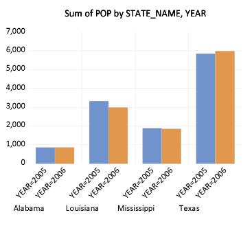
While this particular ordering of bars has its merits, grouping by STATE_NAME makes more sense here since presumably, we want to compare population values for a given state across the two years. Rearranging the factor specification so that STATE_NAME precedes YEAR in the list, we now display the graph with the bars grouped by state.
It is considerably easier to visually assess the change in state populations. Not surprisingly, we see that the bulk of the population decrease occurs in Louisiana, and to a lesser extent Mississippi. Texas experiences population growth over the period, in part due to relocations from neighboring states.
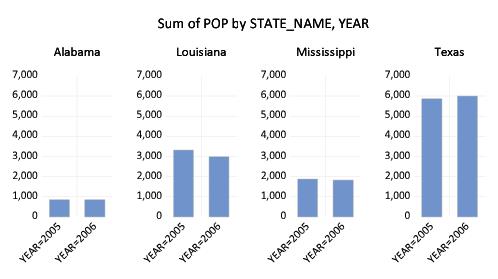
Up to this point we have displayed our categorical graphs within a single graph frame. To display graphs for each category in a separate frame, you should enter the factor name in the edit field. For example, to display a graph comparing state population across years with each state in its own frame, we enter YEAR in the and STATE_NAME in the edit fields. Click on to display the graph. (We have rearranged the graph so that all four frames appear on a single line by right-clicking on the graph and selecting ; see
“Working with Multiple Graphs”.)
Note that by default, the multiple graph frames employ common vertical axes scales. This feature facilitates comparison of the series sums across states in different frames.
To turn off this feature, select or double-click on the graph to open the dialog, then select under the group on the left-hand side of the dialog.
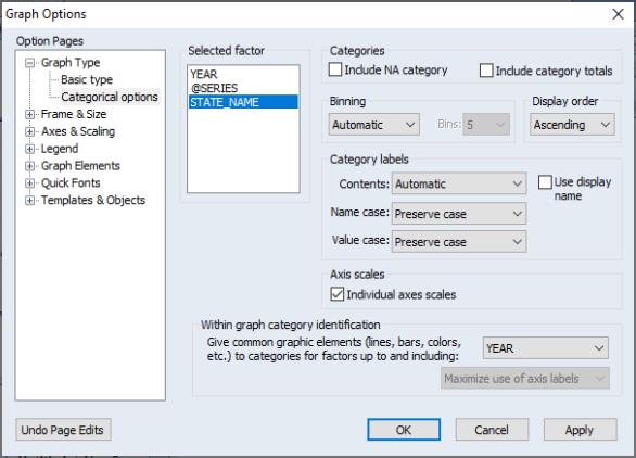
The dialog permits control of settings for category definitions and labels, as well as axis scaling. We will have much more to say about the category and label settings later (
“Factor Display Settings”). For now, we focus on the section.
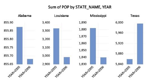
You will use the list box to select the factor whose properties you wish to modify. In this case, we want each state to have its own scale, so we click on , and select . Click on to accept the changes and display the modified graph.
Each graph frame now has its own axis scale, making it easier to see the year-to-year changes, but more difficult to compare the changes across states. While the common scaling made it difficult to determine whether Alabama experienced an increase or decrease in population, the individually scaled graphs clearly show a small reduction in population in that state over the two years.
Line Graphs
One special case of categorical summary plots involves examining line graphs constructed from the summary statistics. While there is a general correspondence to the graphs described in
“Category Summaries”, there are some important differences in the specification of these graphs which require some discussion.
We illustrate these techniques using data from the Panel Study of Income Dynamics (Cornwell and Rupert 1988), as discussed by Baltagi (2001). The data (provided in “Wages.WF1”) consist of wage and demographic information for 595 individuals taken over 7 years from 1976–1982. For our purposes, we focus on three binary factors: FEM, a (0, 1) indicator for whether the individual is male (FEM=0) or female (FEM=1), UNION, a (0, 1) indicator for whether the wage is set by union contract, and EXPER, a measure of the number of years of full-time work experience.
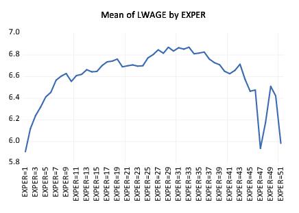
Suppose, for example that we wish to examine the earnings-experience profiles for all of the individuals in our sample. Our approach will be to compute the average earnings at each experience level and then to display a line graph connecting the mean values. Note that a key feature of EXPER is that is numeric (cardinal), so that it does make sense to draw a line between summary values computed at different experience levels.
First, open the log-wage series LWAGE and select to display the graph dialog. Then, select from the dropdown in the middle of the dialog and from the list to identify the main graph type.
Next, select in the dropdown on the right-hand side of the dialog to compute the means of LWAGE for each of our categories.
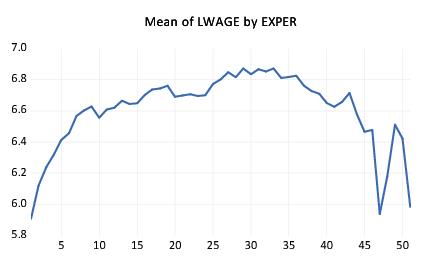
Lastly enter “EXPER” in the edit field and click on to accept the settings. EViews will display the average earnings-experience profile computed across all of the observations in the workfile as depicted. The profile is generated by computing the mean of LWAGE for each level of the factor variable EXPER and plotting the category means against the category values using a line graph. Note that there is a dropoff in the profile at around 30 years of experience.
You may notice that the horizontal axis labels showing the category identifiers in this graph are not very attractive (e.g., “EXPER=21”). We will use the page to modify these labels.
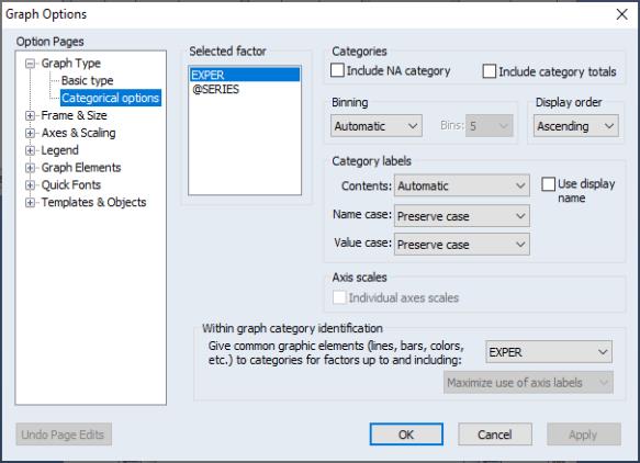
Double-click on the graph to open the dialog, then select under the group on the left-hand side.
Since we want to change the labeling of the categories defined by levels of experience, we select in the listbox. The settings of interest are in the section labeled .
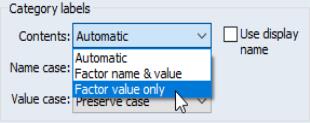
The dropdown menu provides three settings for the category labels. The default setting, , lets EViews choose the labels. In this example, is equivalent to the second setting, , where we form labels using both the name of the factor (“EXPER”) and the value of the factor (“20”). In this case, we want to display only the factor value so you should select . Click on to accept the updated graph settings.
The factor labels in the graph are shorter and slightly easier to read now that they omit the factor name and use only the factor value.
If desired, you may make two additional customizations of the display by double-clicking on the horizontal axis to bring up the dialog page, and setting the to , starting at 0, with steps of 5. This setting automatically rotates the labels to horizontal.
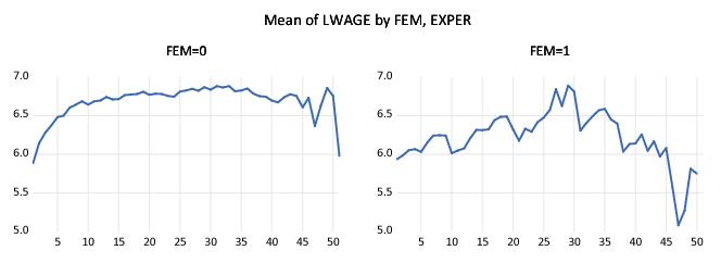
Next, suppose that we wish to compute separate profiles for males and females and to place them in different graph frames. Simply double-click on the graph to display the dialog, and enter “FEM” in the edit field. Click on , and EViews will display the two wage-experience profiles in separate graph frames. (Note that we have again rearranged the graphs so that they are next to each other by right-clicking on the graph and selecting . We will rearrange many of the following graph examples in this manner.)
The shapes of the two graphs suggests that the bulk of the dropoff in the overall profile comes from the steep decline in the profile for women at 30 years of experience. (Note that the factor label and interval settings were retained when we added the FEM factor.)
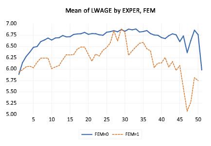
Suppose instead that we wish to display the separate profiles in a single frame. Double click on the graph to bring up the dialog and move “FEM” from the to the edit field so that the latter reads “EXPER FEM”. The resulting graph shows the wage-experience profile for both males and females in the same graph frame.
The order in which we enter the factors in this latter example requires some discussion. The rule-of-thumb is that factors should be entered from slowest varying to fastest varying, so that the values for the second factor are grouped within the first factor, and values for the third factor are grouped within the second factor, and so forth.
In this case, however, the first series, EXPER, appears to vary more rapidly than the second series, FEM (the variation in EXPER for a given level of FEM using a line), despite preceding it in the list of within series. The apparent reversal of ordering arises from the combined effect of two simple rules: (1) the slowest varying factor is placed along the observation axis, and (2) line graphs connect data along the observation axis. Since we want to draw lines connecting levels of EXPER along the observation axis, it is entered first in the list.
We describe various implications of the rules for specifying factors in greater depth in
“Specifying Factors”. For now, it is probably sufficient to note that the specified ordering is probably the most natural way of describing the problem since we would probably refer to this graph as displaying the “wage-experience profile, conditional on gender.”
Analytical Graphs
You may display categorical graphs where, in place of computing simple descriptive statistics such as the mean or sum, we construct an analytic graph (Distribution, Quantile-Quantile, Boxplots) for each subset of observations.
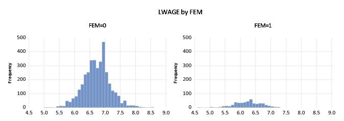
We begin our example with a simple categorical histogram of the log-wage series from the PSID data described above (
“Line Graphs”). Consider first a simple example showing a histogram of LWAGE with FEM as an across factor. The procedure is straightforward: select and for the from the middle of the dialog, select for the type, and place FEM in the across list. Click on and EViews will display the two histograms in individual graph frames.
If desired, you may change the multiple graph axis scaling to allow for individual scales as described in
“Descriptive Statistics”.
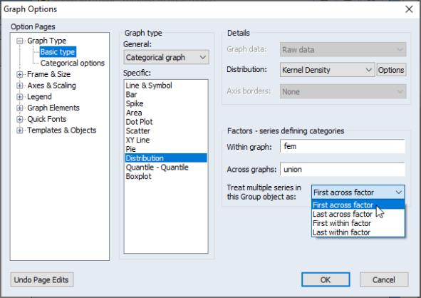
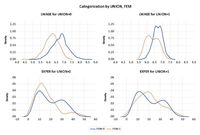
Next, we consider slightly more complicated examples involving multiple series and multiple factors. We begin by displaying kernel density plots of two series, LWAGE and EXPER, using FEM as a within factor and UNION as an across factor. First, create a group containing LWAGE and EXPER, then select from the group menu to display the graph dialog. From this point, constructing our example graph is a four step process:
• First, select and as the .
• Select from the drop-down.
• Enter “FEM” in the edit field, and “UNION” in the field.
• Select (the default) in the dropdown.
The last setting, which is displayed only when graphing multiple series, may appear to be a bit obscure, but the basic idea is really quite simple.
Each series in the group may be viewed as a subset of the data in the workfile. Accordingly, we may define an implicit “series factor,” which we denote @SERIES, that divides the workfile data into subsets corresponding to series. In our example, data in the first series of our group are said to be in the category defined by “@SERIES=LWAGE” while data in the second series are in category “@SERIES=EXPER”.
Since @SERIES is a factor, we may choose to have it vary within or across graphs. If it varies within graphs, data for both LWAGE and EXPER will be displayed in a single frame; if it varies across graphs, data for the two series will be displayed in different graph frames. (The choice between plotting the multiple series data in a single graph or in multiple graphs may sound familiar since it corresponds to the option for basic graphs; see
“Multiple Series”.)
The dropdown menu allows us to insert the implicit @SERIES factor at the beginning or the end of the list of within or across factors. By default, EViews treats @SERIES as the (most slowly varying across factor), but you may move it to the end of the across list or the beginning or end of the within list.
The current example specifies @SERIES as the first, and UNION as the second across factor. Since @SERIES varies more slowly, values of UNION will be grouped within @SERIES. We see the effect of this grouping since the first two frames are for data where “@SERIES=LWAGE” paired with “UNION=0” and “UNION=1”, respectively, followed by “@SERIES=EXPER” for the two union values.
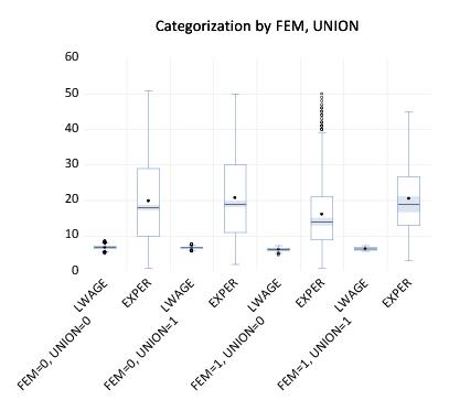
Similarly, we may display a categorical boxplot with FEM, UNION and @SERIES as within graph factors.
First, double click on the graph, being careful to select the entire graph, to display the dialog and change the graph type to . Next, move the UNION factor to the end of the edit field, and change the multiple series dropdown to .
The resulting graph displays eight boxplots in a single graph frame. The implicit factor @SERIES has been placed at the end of the within list so that it varies fastest. We see that LWAGE and EXPER are displayed for each level of FEM and UNION, that the levels of UNION vary within each level of the first factor FEM.
Identifying Categories
The second major type of categorical graph displays the raw data along with category identifying information.
We consider four representative examples of these graphs: a scatterplot, a spike plot, a line plot, and a dot plot. The first two examples, which involve multiple observations in each category, use the setting for the dropdown; the last example, where there is a single observation in each category, uses the special setting.
Raw Data
We consider here two categorical graphs that employ the setting in the dropdown. As you might expect given the name of the setting, these graphs all display the underlying (raw) data in the series.
One commonly employed raw data categorical graph is a scatterplot where observations in each category are displayed with a different symbol. Our first two examples use data in the workfile “Mpg.WF1” on EPA reported miles-per-gallon and engine size (displacement) for a subset of 2006 model year automobiles.
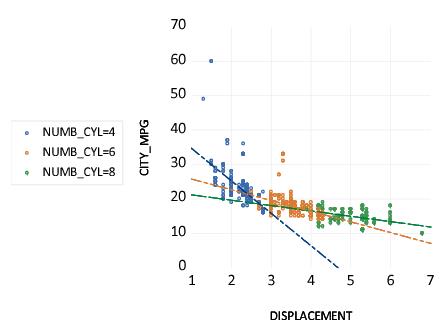
We construct a categorical scatterplot of city miles-per-gallon (CITY_MPG) against engine size (DISPLACEMENT), using the number of cylinders (NUMB_CYL) in the engine as a within factor. First, create a group containing DISPLACEMENT and CITY_MPG. Simply specify and as the , leave the setting at , and enter “NUMB_CYL” in the edit field. To draw a set the linear regression lines through the points in each class, set the dropdown to .
The resulting graph uses color and symbol choice to identify categories. Since we have selected , every valid observation in the sample is displayed using category specific colors and symbols. Not surprisingly, we see that engines with greater numbers of cylinders have a larger displacement. More interestingly, there appears to be a weaker relationship between DISPLACEMENT and CITY_MPG for cars as the number of cylinders increases, though the two high MPG outliers may be unduly influential in that comparison.
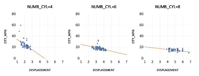
We may compare this categorical graph to one in which we treat NUMB_CYL as an across factor:
Here, each set of raw data points is displayed in its own graph frame, using common axis scaling. The points all use the same color and symbol since the graph frame titles are sufficient to identify the group displayed in the frame.
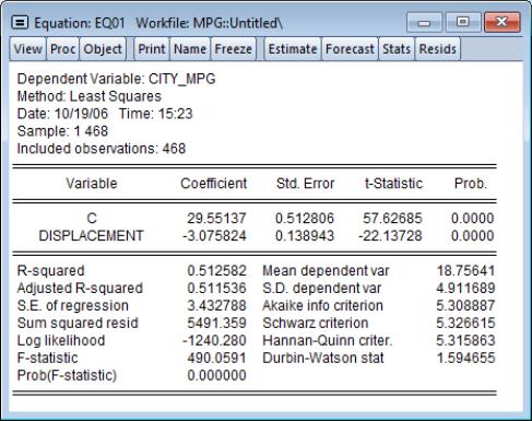
Our second example uses categorical raw data graphs to explore differences in the regression fit of CITY_MPG to DISPLACEMENT. We first estimate the linear regression of CITY_MPG on DISPLACEMENT then save the residuals from this equation to the series MPG_RESID. Note that the equation results in EQ01 assume a common slope coefficient on DISPLACEMENT; the scatterplots above suggest that this assumption is not valid.
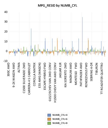
As further evidence that the equation assumptions are not valid, we display a categorical bar plot of MPG_RESID using NUMB_CYL as the within factor. This graph shows each value of MPG_RESID, with observations in different classes drawn using different colored bars.
While it may be a bit difficult to see in the printed black-and-white form of the graph, the size of the equation residuals appears to be negatively related to the number of cylinders; in particular, almost all of the very large positive residuals are for 4-cylinder vehicles. The correlation between residuals and number of cylinders suggests that, at the very least, number of cylinders is an omitted variable in the equation. Note that EViews shows only observation indices since there is insufficient space to show observation labels.
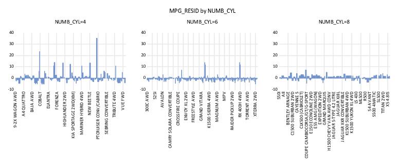
The visual comparison of residuals for cars with different numbers of cylinders may be facilitated by treating NUMB_CYL as an across factor:
The negative relationship between number of cylinders and the size of residuals is readily apparent in this graph. Note that since there are fewer observations plotted in each of the graph frames, EViews switches to showing some of the observation labels from the workfile.
Unique Values
Our final example uses the data setting.
We again employ the workfile “Gulfcoast.WF1” containing population information for counties in the Gulf Coast region of the United States. For this example, we restrict ourself to displaying values for counties in Louisiana by setting the sample to only include observations where the STATE_NAME = “Louisiana”.
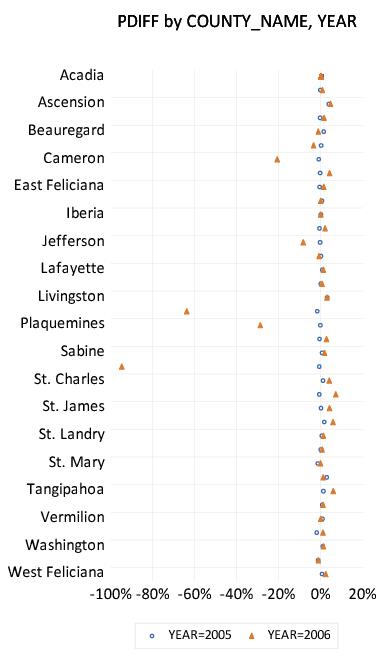
We display the percentage change in population for counties in Louisiana in 2005 and 2006 using a categorical dot plot. The categorical plot uses the factors COUNTY_NAME and YEAR, with YEAR entered last in the within list since we want to compare population values in the two years for a each county.
A slightly customized version of the graph is depicted here. The filled triangles represent the proportionate changes in population in 2006; the open circles represent the 2005 changes. We see that there is a large disparity in the effect of the hurricanes across counties, with three counties: St. Bernard, Orleans, Plaquemines, and to a lesser extent Cameron and Jefferson bearing the brunt of the impact.
Constructing this particular graph is straightforward, requiring only a few steps.
First, we display the graph dialog for PDIFF and set the to and , and choose from the dropdown.
Since we want to plot a graph grouping different years for each county together, we enter “COUNTY_NAME YEAR” in the edit field.
Next, despite the fact that we wish to plot every observation in the sample, we set the setting to . Note that this is a change from previous examples where we used the setting.
This latter choice requires a bit of discussion. Since we are displaying a plot of every observation (every county and period) in the sample, you might at first think of selecting for this setting. Recall, however, that using will produce a plot with each observation identified in some way as belonging to a category. In this case, since every observation is in a different category (county and period), selecting will produce a dot plot that uses a separate row and symbol for every observation. This is obviously not the desired effect.
Selecting tells EViews that (using the default settings in the dialog) despite the fact that we are plotting every observation, we want to plot both year values for a single COUNTY_NAME on a single row, and that we want to use unique graph elements across years, but not across counties. Thus, different YEAR observations are given different symbols within a county, but the set of symbols used to identify the two years is the same across different counties.
If all of this seems rather abstract or mysterious, we will examine this issue in greater depth in
“Specifying Factors”. For now, you may follow a simple rule-of-thumb: if your factors define groups containing only one observation each, you generally should select to obtain the desired graph.
Lastly, we use the dialog under the section to change the height and aspect ratio to 6 and 0.50, respectively. In addition, we employ the dialog, also under , to display the bottom axis scale in of , with a “%” suffix, and to draw a zero line.
