Distribution Plot Data
EViews offers the ability to display a variety of what we term
analytical graphs—graphs created by first performing data reduction or statistical analysis on the series, then displaying the results visually (
“Analytical Graph Types”). The central feature of these graphs is that they do not show data for each observation, but instead display a summary of the original data. One important class of analytical graphs are
distribution graphs, which show various aspects of the distribution of the data in a series. Included among these graph types are histograms, kernel density plots, theoretical distribution plots, and theoretical quantile-quantile plots.
Typically, you will access the distribution graph tools by selecting from the series window and then making the appropriate choice (see
“Graphing a Series”). These graph tools allow you to display the constructed data graphically, but not to examine them directly.
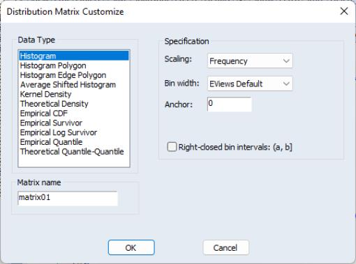
In some cases, you may wish to save the data depicted in the graph, possibly for further analysis. To do so, simply select to bring up a dialog that is quite similar to the main graph dialog:
On the left-hand side of the dialog is a list box showing the types of distribution graph data that may be saved, along with the name of a matrix in which to save the results. As you select entries on the left, the right-hand side of the dialog will change to reflect the different options that are available for your selection. Specify your options as desired and click on to save your results.

