Graphs
Animated Graphs
Static graphs display data for a fixed range of observations. That range may consist of a single observations or multiple observations, but it does not change.
EViews 12 introduces animated graphs, where you can dynamically adjust the range of data and thusly display how the data change over a given interval. Animated graphs allow viewers to see how data transition from period to another or alternatively compare the data between periods.
An animated graph is nothing more than multiple static graphs displayed one after another. This gives the impression of motion. To animate a graph, one of 2 things or both must change, the axis range and/or data range. When changing either the axis or data range, you must adjust one or more of the following: axis min/max and data min/max values. Additionally, you must determine by how much to adjust those value. Depending on these min/max increments used, graphs can appear to move, grow, or both.
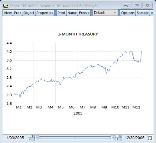
A typical line graph of the 1-Month Treasury bond rate would appear as:
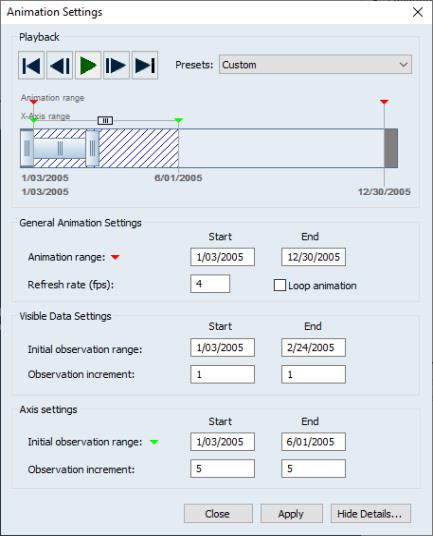
With the use of animated graphs, you can view how the bond rate changes as a function of time. To do so, press the button in the toolbar and the animation dialog will appear. Next press the button.
The animation dialog is broken up into 4 main sections by which each section controls a different portion of the animation. There are sections for , the , and . The playback settings allow you to start and stop the animation, choose one of the predefined animation types, and give you a visible representation of how the graph will be animated.
For additional discussion, see
XY Error Bar Graphs
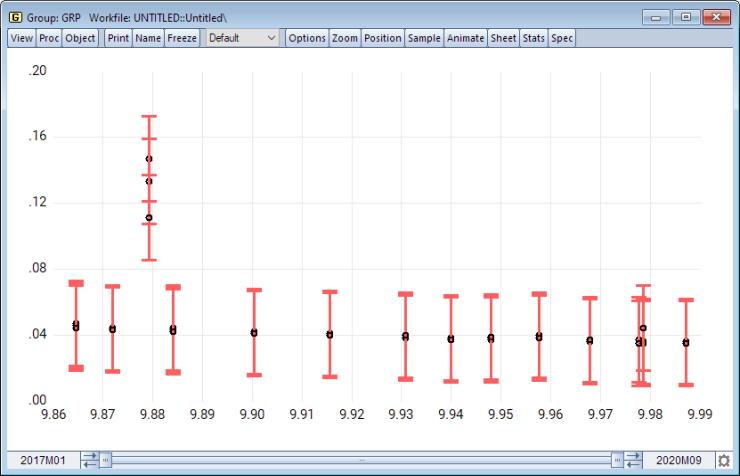
The XY error bar graph is an observation graph of a group containing a multiple of four series. The first series contains the x-axis points, the second series is the upper error bar, the third series is the lower error bar, and the fourth series is the data series plotted as a symbol. They are designed for displaying data with standard error bands against a non-observation based series. You may display an XY error bar graph for any group object containing four or more series.
To illustrate XY error bars, we will create a plus/minus one standard deviation confidence bands around the US unemployment rate. We will then plot this as a function of the US GDP.
Make a monthly workfile from 2017m1 to 2020m9. We can do this by issuing the command:
wfcreate m 2017m1 2020m9
Fetch the unemployment rate and GDP from the FRED database as follows:
dbopen(type=FRED)
fetch(m) unrate
fetch(m) gdp
close FRED
Transform the GDP into logs, and force the unemployment rate into a (0,1) interval by dividing by 100. This is done as follows:
gdp = log(gdp)
unrate = unrate/100
Make the lower and upper one standard confidence bounds around the unemployment rate:
series unrate_low = unrate - @stdev(unrate)
series unrate_high= unrate + @stdev(unrate)
Next, create a group with the first series as the DGP, the second as the upper bound for the unemployment rate, the third as the lower bound for the unemployment rate, and the final as the unemployment rate series itself.
group grp gdp unrate_high unrate_low unrate
Finally, make the XY error bars for unemployment rate as a function of GDP. Interactively, open the group GRP, select from the group menu, and then choose in the list box.
By command, you may simply type
grp.xyerrbar
In contrast to the usual error bars which generate low and high values based on the observation index, the xy error bars plot the low and high values as a function of the grid populated by the unobserved series, in this case GDP.
Sample Line and Shade Placement
Previously, when adding lines and shades to a frozen graph, EViews prompted you to place the new element using observation indices (“1”, “10”, etc.) or dates and date pairs.
EViews 12 adds the ability to specify placement of these elements using sample statements. This feature makes it easy to place objects at irregular elements in dated workfiles, when for example, using if conditions to highlight observations meeting a condition, say high unemployment. Similarly, you may now use predefined sample objects to place shade elements, and commonly employed intervals, when for example shading periods of recession.
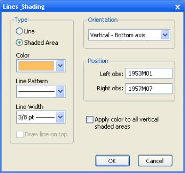
You may draw lines or add a shaded area to the graph. From a graph object, click on the button in the toolbar or select The dialog will appear.
Select whether you want to draw a line or add a shaded area, and enter the appropriate information to position the line or shaded area horizontally or vertically. EViews will prompt you to position either the line with an observation or data value, or the shaded area with an observation, data value, sample object or sample string.
You should also use this dialog to choose a line pattern, width, and color for the line or shaded area, using the drop down menus.